
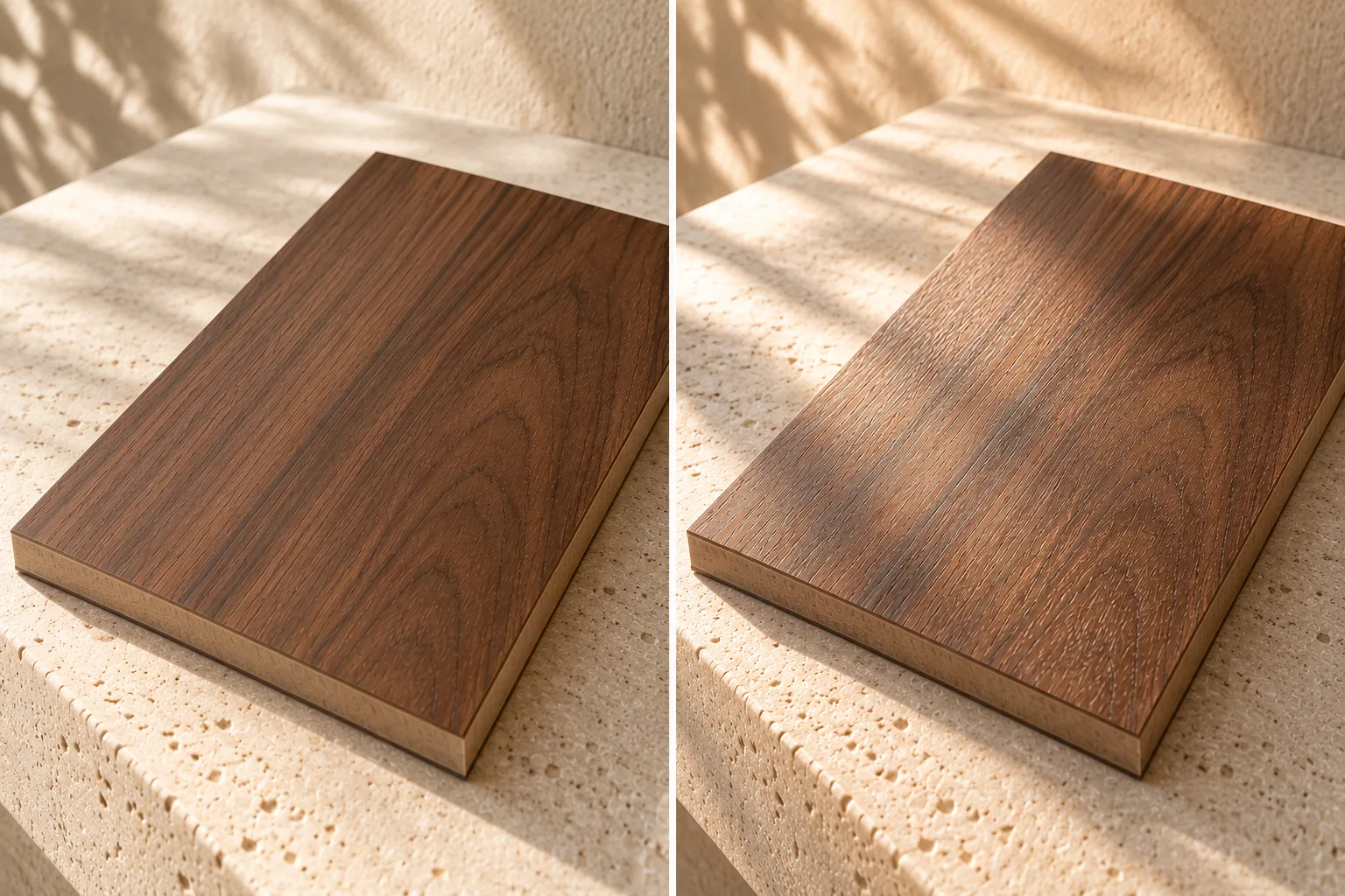
This realistic material study shows the same surface in broad and angled light as fictional inspiration; it makes no colour-correction claim.
Finish changes the conversation.
A quieter surface response may read softly from across a room, while a more reflective finish can show a stronger relationship with windows, lamps and moving bodies. Texture can make a highlight break into smaller parts. These are visual observations, not a substitute for the finish system and care information for a specific product.
When comparing samples, keep the base material, viewing distance and surrounding colours as consistent as possible. Otherwise it is easy to attribute a difference to sheen when the room is doing the work.
Test the light that will actually be there.
- Daylight: look near a window and note whether the direction of the grain or texture becomes more pronounced.
- Warm and cool sources: compare the sample beneath the lamps likely to remain in the room, at the time it is normally used.
- Raking light: move a light or the sample so it travels across the face. Small relief and surface marks may become easier to see.
- Distance: step back, then come close. A finish that is interesting as a macro may be too active across a large field, or the reverse.
Record what you saw.
Write down the sample reference, the direction of the light and the surrounding finishes. If the result matters, repeat the check at another time of day. Ask the studio or supplier for the confirmed finish name, application method and care instructions before a final decision.
Elegance Veneers is a place to compare a real sample with the room photograph or drawing. Call 0788 780 0066 or 8855 080 065 before a visit if you need to confirm the practical details of the appointment.